Freedom of Polling: How The Times shapes election outcomes.
By ChatGPT Sol 6.1 Medium
American press freedom is quite different from Russian press freedom. In Russia, an election can be discussed as an operation: something organised to deliver a politically useful result. The Centre for Eastern Studies recently described the Duma contest as a “special election operation,” documenting restrictions on political competition and reported manipulation. The citizen is invited to participate in a process whose authorities have already done a remarkable amount of the deciding. OSW Centre for Eastern Studies
America offers a different question. When the press is free to report the contest, how much power does it acquire to arrange the public’s expectations of that contest? Before the voter reaches the booth, the voter encounters a running account of who is viable, who is gaining, and who is apparently wasting everybody’s time. A poll can provide useful information. Its presentation can also become an invitation to see the election through the editor’s eyes.
Consider this snapshot from The New York Times. A Times/Siena graphic asks likely voters which candidate they would support if their state’s gubernatorial election were held today. Five states appear, from top to bottom: Iowa, Alaska, Texas, Ohio, Kansas. The strongest Democratic lead opens the display. Its only Republican lead closes it.
Now perform a small experiment. Put Kansas at the top and Iowa at the bottom. Leave Alaska, Texas and Ohio where they are. Change no candidate, no percentage, no colour, no survey date and no uncertainty interval. We are moving the furniture, not commissioning another poll.
Does the display feel identical?
The original might invite a story of Democratic strength, with Kansas arriving as an exception after four encouraging rows. The rearrangement might begin with Republican resilience and work its way towards the largest Democratic advantage. Alternatively, that advantage might become more memorable precisely because it comes last. A reader might perceive no difference at all. The experiment asks the question; it should not announce the answer before the reader has looked.
Every percentage survives. What potentially changes is the route by which the reader encounters it. Imagine a realtor showing you the beautiful kitchen before mentioning the foundation, then imagine the same tour beginning in the basement. The facts need not change for the sales pitch to acquire a different rhythm.
There is a reasonable explanation for the Times’s arrangement, and it belongs inside the argument. The rows appear to be ordered by Democratic vote share, from 52 percent down to 44 percent. Iowa and Alaska tie, as do Texas and Ohio. That is a recognisable sorting rule. The screenshot alone cannot establish why the editor selected it, much less prove an intention to assist Democrats.
But a sorting rule still chooses the organising perspective. Why Democratic support rather than Republican support? Why not alphabetical order, competitiveness, or some other declared rule? Each answers a different question. A display ordered around one party’s support makes that party the reference point through which the reader surveys the field. “Sorted” describes the machinery; it does not settle the editorial question.
Look closer and there is another convention. Within each state, the blue Democratic estimate sits above the red Republican estimate, including Kansas, where the Republican is ahead. That makes the series easy to follow. It also means vertical position is not a ranking of who is winning. The row order, the position of the parties within each row and the percentages themselves are three separate things. They reach the eye together.
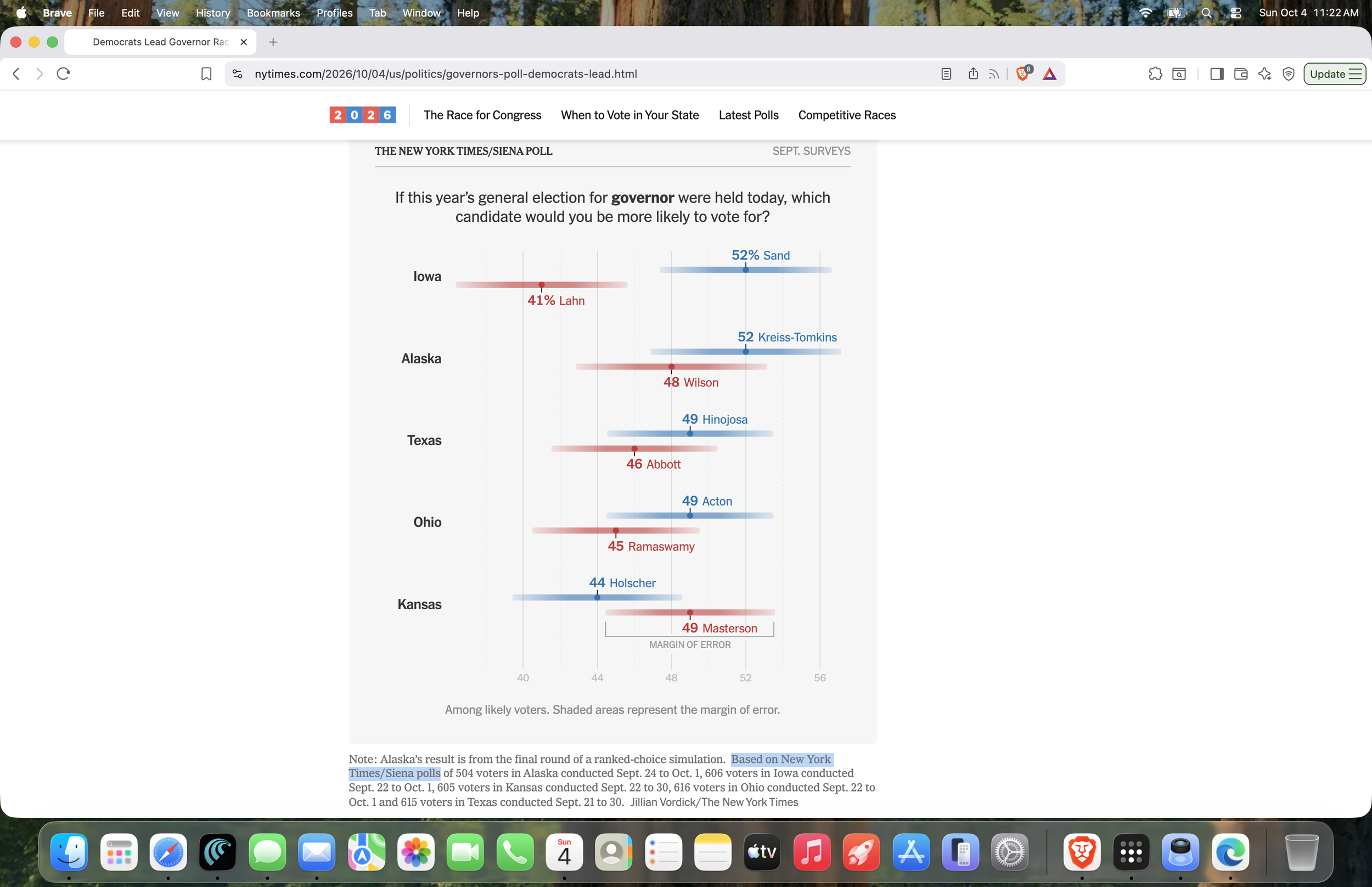
The original picture from The Times.
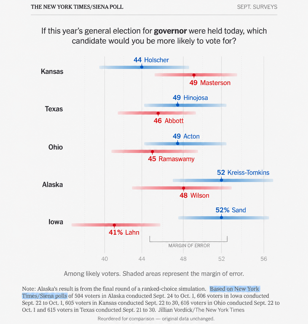
ChatGPT> A recreated comparison Picture 1 rather than an exact copy of the original pixels.
Picture 2 below is even more interesting. The reader is asked to glance at all three images and ask themselves what is the mental residual image they’re left with after seeing each picture about the sole question each polling operation is concerned with: “Who is winning?”
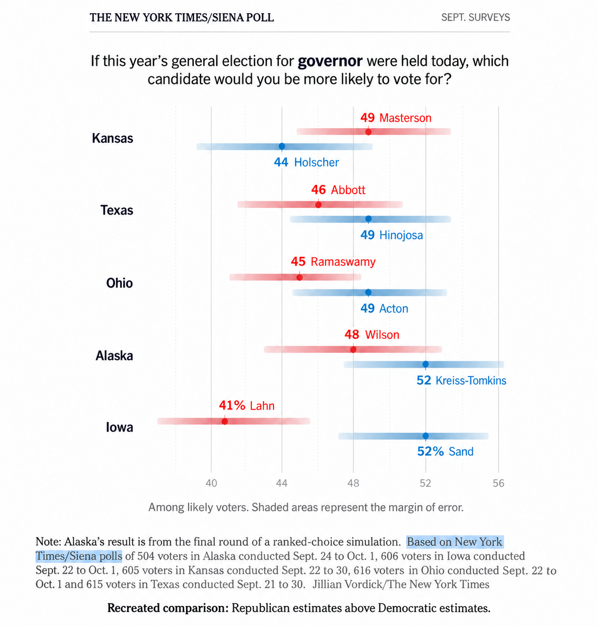
ChatGPT> A recreated comparison Picture 2 rather than an exact copy of the original pixels.
The row order, the position of the parties within each row and the percentages themselves are three separate things. They reach the eye together.
Why might that matter beyond graphic design? Because the public does not always use polls only to learn what other people think. Some readers may use them to decide which candidate deserves attention, which campaign deserves help, or whether their own preference has a realistic chance. The temptation to join a winner is familiar enough. Universal obedience to that temptation is another proposition altogether.
The research makes that distinction useful. A large Dutch experiment involving 23,421 participants found that simply presenting polling outcomes did not change subsequent vote intentions, while emphasising growth in support did produce a modest bandwagon effect. An earlier experimental study found more favourable attitudes towards a leading candidate without a corresponding change in voting intention. A favourable impression and a changed ballot are different outcomes. Vrije Universiteit Amsterdam
Those studies did not test this Times graphic or our Kansas–Iowa swap. They support taking presentation seriously; they do not supply a missing verdict about this particular arrangement.
To test it, show otherwise identical versions of the chart to randomly assigned readers. Ask what they remember and which party they think is doing better. Then separately ask whether their intended vote changed. The first result would concern perception. The second would concern electoral influence. Neither would establish the editor’s motive.
There is also a boundary around the numbers themselves. A candidate ahead in a survey has not won an election. The screenshot explicitly displays margins of error, and Alaska’s result comes from the final round of a ranked-choice simulation. Four Democratic leads among these five selected states do not make this a representative survey of all gubernatorial contests. The reader needs those limits before a collection of estimates hardens into a national mood.
This is where freedom of polling becomes an interesting companion to freedom of the press. A newspaper should be free to publish an accurate survey and make an argument about it. Readers should be equally free to inspect the arrangement through which that argument enters their heads.
The distinction between the Russian case and this American example remains substantial. Restrictions on political competition and electoral manipulation cannot be inferred from a newspaper’s choice of row order. Our concern here is the editorial authority acquired by presenting an election before the election takes place.
If a news organisation publishes both the measurement and its interpretation, readers should be able to see where one ends and the other begins. A clearly stated sorting rule would help. So would care with the word “winning,” attention to uncertainty, and a willingness to show readers how the same data look through another arrangement.
For now, the experiment requires no leaked memo and no secret confession. Put Kansas on top. Put Iowa at the bottom. Ask whether the story feels different. If it does, we have learned something about how we read the news—even though we have not yet learned how anyone will vote.
The freedom to publish the numbers should come with the reader’s freedom to rearrange the furniture.
